Responsive Design
Demystified
Created by Paul Balchin
← → ↑ ↓ navigate,
S speaker's view and notes,
Esc bird's eye view
This presentation
is about “Why?”
Game Development |
 |
Web Development |
Designers &
Developers
Project's process
| Games (complexity: 3) | Web (complexity: 6) | |
|---|---|---|
| Design | (1) Layout and images | (1) Layout and images |
| Develop | (2) unity 3d |
(2) Front-end Code
(html, css, js, images, videos)
|
|
(3) Back-end Code
Language: C#? Java? PHP?
Database: MSSQL? MySQL? NoSQL? Platform? None? CMS? |
||
| Compile | Compile for iOS, Android, Windows Mobile |
Front-end
Minification (css, js, images)
Back-end
Depends on back-end language
|
| Test | (3) QA | (4) QA |
| Make Public | Upload to iTunes, Google Play, Windows Store |
(5) Local and Web Hosting
At Fuel?
At Client? At Third Party: MS Azure? Amazon WS? |
| Documentation | N/A? | (6) Setup, maintenance, modification |
| Consume | Download from iTunes, Google Play, Windows Store |
Load in web browser |
Design considerations
| Games | Web | |
|---|---|---|
| Device | Screen size | Browser width |
| Screen orientation | Landscape only | Landscape and portrait |
| Resizing | Scaling | Responsive |
Development considerations
| Games | Web | |
|---|---|---|
| Device | Phones, tablets | Phones, tablets, laptops, desktops |
| Input | Touch only | Mouse, keyboard, touch |
| Screen size | Small-ish | Any |
| Screen orientation | Landscape only | Landscape and portrait |
| Resizing | Scaling | Responsive |
| Browser * | N/A | All |
| Older browsers * | N/A | Depends on browser ** |
| Desktop OS * | N/A | All |
| Mobile OS * | iOS, Android (Mobile Windows?) | All |
| Data | User's device | Cookies, LocalStorage, Server-side |
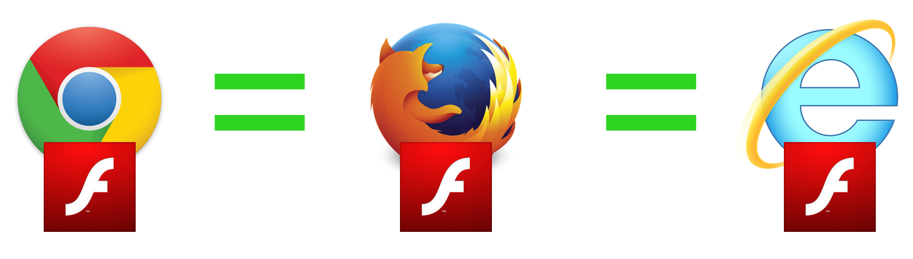
* Some combinations can cause strange behaviours.
Major offenders = Internet Explorer, Mobile Safari = massive time suck.
** ... or whatever browsers the layout framework will support, whichever is more restrictive.
Front-end development
| CMS (e.g. Wordpress or Joomla) * | Fuel Internal | |
|---|---|---|
| Layout Framework | Already using Bootstrap or Foundation | Download Bootstrap or Foundation |
| HTML 4 or 5? | HTML 4 or 5 | HTML 5 |
| Platforms |
built, tested, and debugged by a large team of developers, across all platforms, under continuous improvement (i.e. full-time employees). |
|
| Third Party Libraries * |
built, tested, and debugged by a small team or single developer, across some platforms, under sporadic improvement (i.e. volunteers). |
|
| Internal Coding * |
built, tested, debugged by the project's developer and QA, across whatever devices are available in QA that day, under improvement only until pushed out the door. |
|
* Content Management Systems (CMS) typically include their own ecosystem of plugins and, rarely, might not allow external libraries or code.
<www/>
What is CMS?,
Drupal,
Joomla,
Wordpress
Today
General web development and responsive design
Common, accepted practices

Focus: HTML and CSS
HTML is content (plain text, ebooks)
CSS adds style and structure (glossy magazine layouts)
<www/> CSS Zen Garden
CSS layout frameworks
<www/>
Bootstrap,
Foundation
Responsive web design asks two simple questions:
What is the width of the browser's window
and how do we react to it?
Ask “What width?”
Not “What Browser?”
Ask “What width?”
Not “What Operating System?”
Ask “What width?”
Not “What Device?”
Web “pages”
Think “Word documents for the Internet”Basic elements
Text
Containers (e.g. paragraphs, tables)
Objects (e.g. images, videos)
Basic layouts
One column
Multiple columns
Grids
Floating or fixed elements
“Web” pages
Think “Word documents for the Internet”+ Variable document size
+ Interactive
+ Animation
Inheritance
<html/> Inheritance demo
Repaint and reflow
Even a simple web page is a lot of work.
<video/> Gecko Reflow Visualization demo
Responsive design
Requires constant, high-bandwidth communication
between designers and developers.
The user experience
Same user experience
Web layouts are imperfect
So close, yet so far.
Different browsers

Same browser,
different version
Same browser,
different OS
“Pixel-perfection”
is inflexible
Exact layouts and element placement across all operating systems, devices, and browsers is impossible.
We shoot for
a consistent user experience
Within the same browser or device
Go with the “flow”

Page layout
<html/> Fixed and fluid layout demo
Responsiveness
The width of any container affects only the width of its child containers.
<html/> Responsive demo
Adaptiveness
Many aspects of the page can change based on the browser's width.
<html/> Adaptive demo
“Scaling” is not a “thing”
"Scaling" is a game design process.
We can set the width of any object, such as images and videos, as a percentage of its parent container.
We don't scale text; we change its size based on responsive rules.
CSS scaling is still new
CSS Scaling is an advanced CSS3 method and supported only by the latest browsers.
CSS Scaling objects is not pretty; font smoothing is not guaranteed, images may not re-render properly.
CSS Scaling is limited to the "parent/child" relationship.
Media queries
From phones to 4k monitors,
there are an infinite number of browser window widths.
We use media queries to keep it under control.
What media queries look like
Some media query tests
Browser width and height
Is landscape or portrait? (hand-helds)
Is high resolution? (retina displays)
Is screen or print?
<www/> CSS Media Queries
Adaptiveness
Big changes.
“When do we change the layout?”
<html/> Adaptive demo
Responsiveness
Small changes.
“What do we do between layout changes?”
<html/> Responsive demo
Developing
responsively
“Mobile first”
It's easier to start small and add complexity,
than to start large and then try to simplify.
“Make it beautiful”
HTML + CSS
“Make it functional”
+ JavaScript
“Make it cool”
+ Animation
Designing
responsively
CSS before images
Rounded corners
Gradients
Drop shadows
Failing gracefully
Rounded corners not supported?
Allow for squared corners
Gradient not supported?
Pick a solid color (req'd)
Web font failed to load?
Create a font stack
Font icons before images
Scalable vector art
<www/>Font Awesome
Images at actual size
Games: 200% of largest possible
and then scale down as needed.
Web: actual size, e.g. buttons and icons.
Web: responsive, e.g. background images.
Save on bandwidth: smaller images for smaller devices.
Adaptive comps

Phones vertical and horizontal
Tablets vertical and horizontal
Laptops ("small" desktops)
Desktops ("large" desktops)
4k monitors?
Three basic layout rules
Follow what the layout framework will allow
Otherwise, what's the point of using a framework?
Ignore the layout framework
Only if the framework doesn't meet a specific need.
Don't fear the first two points
Out of the box layout frameworks are amaze-balls.
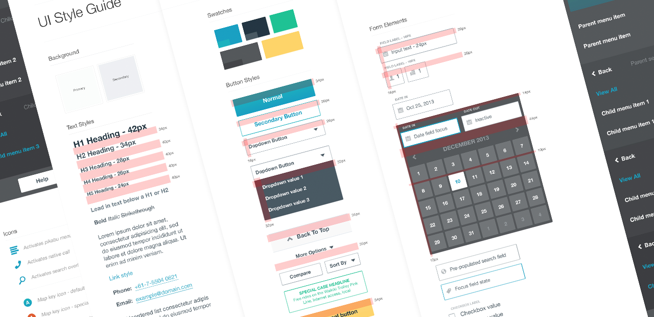
Style guides
A poem
Before media queries
we laid out pages using tables
and nothing was responsive
and with every site
something beautiful died