Flash Charts as a Business Intelligence Tool
Right-click and download this short video demo. (7.5MB)
The MEC (short for Matrix Embedded Component) was in continual development between 2003 and 2007. The just-released Flash version 6 provided all the power and flexibility that HTML, JavaScript, and CSS combined couldn't.
The MEC's interface was built to fill a need: neither Cognos' nor Microsoft Analysis Services' online interfaces provided charting features beyond a basic spreadsheet. However, Cognos did provide comprehensive Web Services and MSAS allowed us to create our own.
I was responsible for 90-95% of the MEC's development, including:
- The user interface. Quaint now, but this was the height of Windows 98.
- Tables and charts.
- The dimension line.
- Context menus and pop-up windows.
- Styling properties used an external XML file.
- Ajax to communicate with Cognos 7 and Microsoft Analysis Services 2000/2005 web services.
- Convert data between XML and object-oriented data (this was before XPath was introduced).
- Display object-oriented data in an easy-to-read format for debugging.
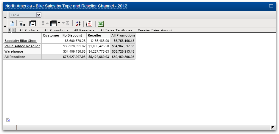
Basic layout
Slide number:
- Default view.
- Chart picker. This is the user's view. The author is presented with more options and the ability to save changes.
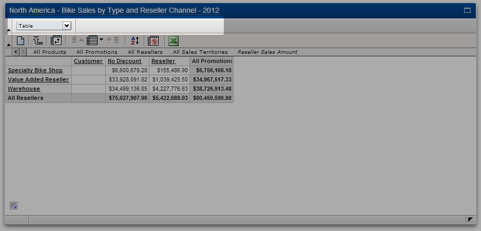
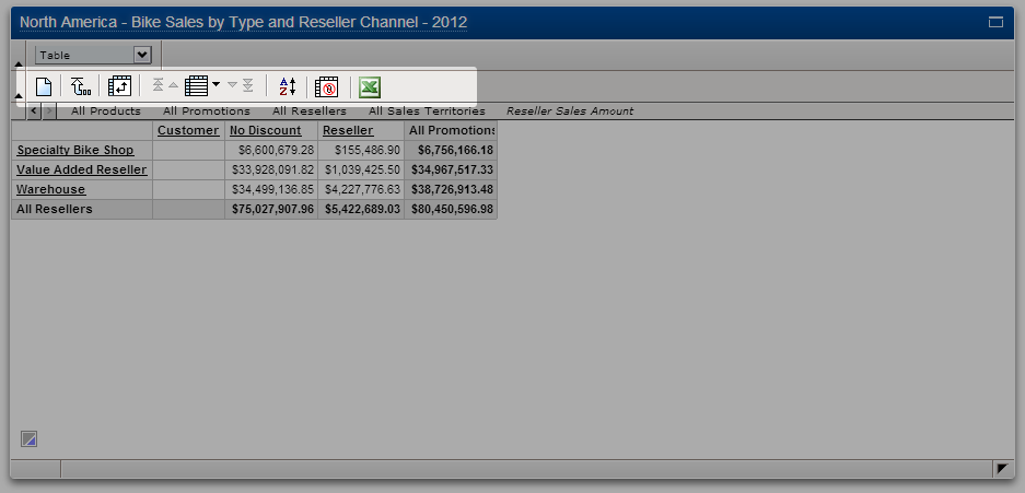
- Commands:
- Clean layout.
- Top of cube.
- Swap rows and columns.
- Pagination control.
- Sort.
- Suppress zeros.
- Export to Excel.
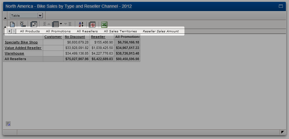
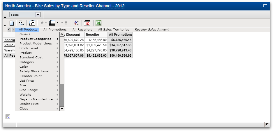
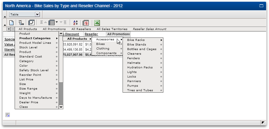
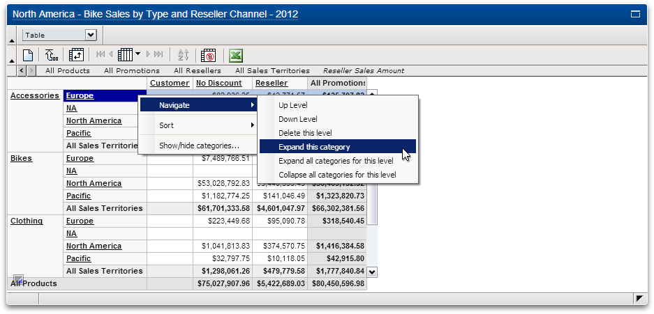
- Dimension Line. Even though dimension lines look like file menus, they are actually a means of both reflecting the current view and of exploring the cube of data.
- The last dimension (in this case "Reseller Sales Amounts") is always the Measures dimension. Measures can be gross sales, profits, units sold, etc.
- Dimension lines can be large and complicated. To speed up its initialization and re-use we did the following: each dimension is only loaded as the user requests it; the results of each request is cached as a Flash "cookie" (i.e. local cache); because the dimension line is cube-specific, the cache can be accessed for any chart using the same cube.
- Dimension Line: first child menu.
- Dimension Line: fourth child menu. The structure of the child menus are a direct reflection of the customer's data.
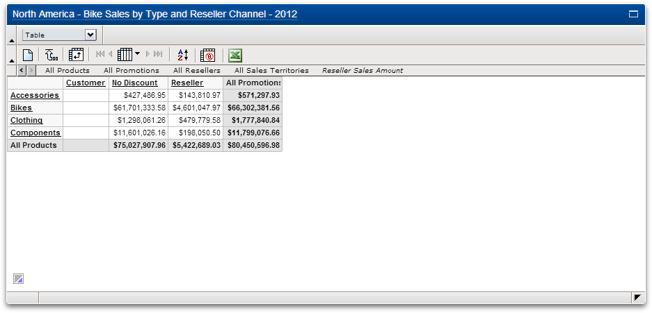
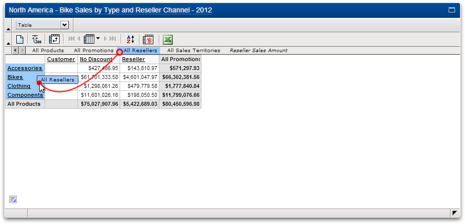
Tables: replacing headers
- Start.
- Drag a dimension atop any row or column header, then drop. Any dimension from any level can do this.
- In this case, "All Resellers" has replaced "All Products".
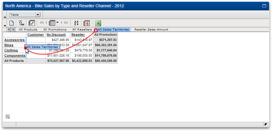
Tables: nesting headers
- Start. Nesting headers only applies to tables.
- Drag a dimension to the edge of any row or column header, then drop.
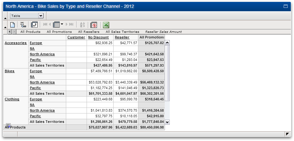
- In this case, each of the categories under "All Sales Territories" have been nested below each of the products.
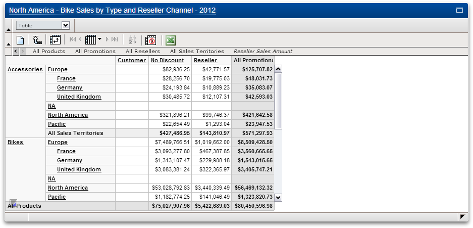
- Each category can be manipulated individually.
- As a result of the previous action, Europe has been expanded for each of the products.
Charts
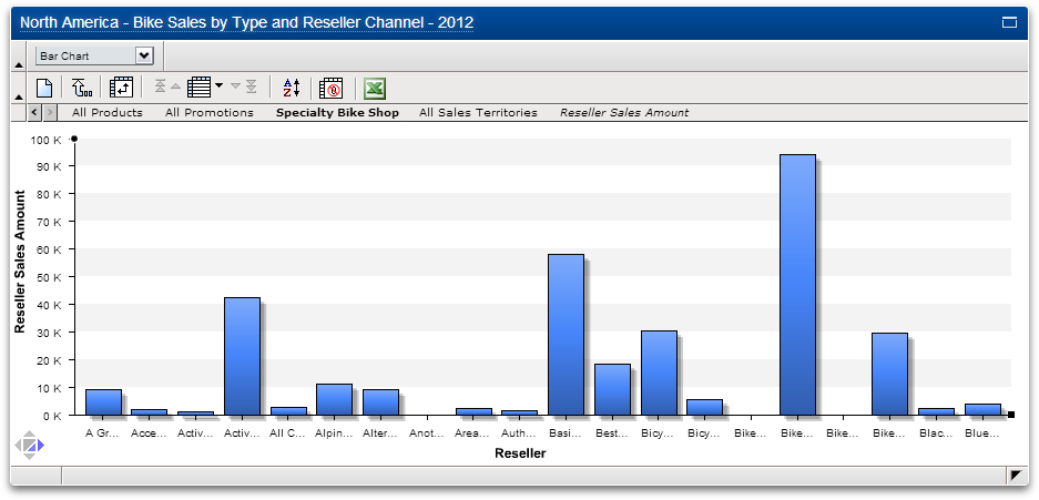
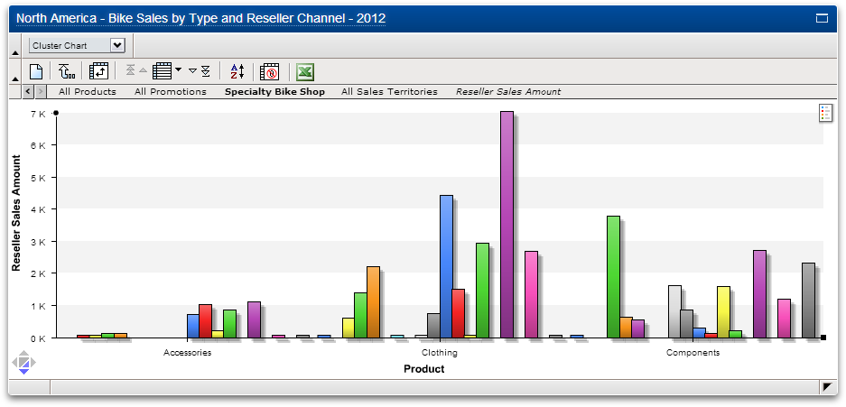
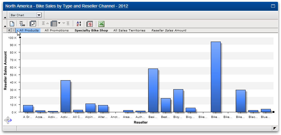
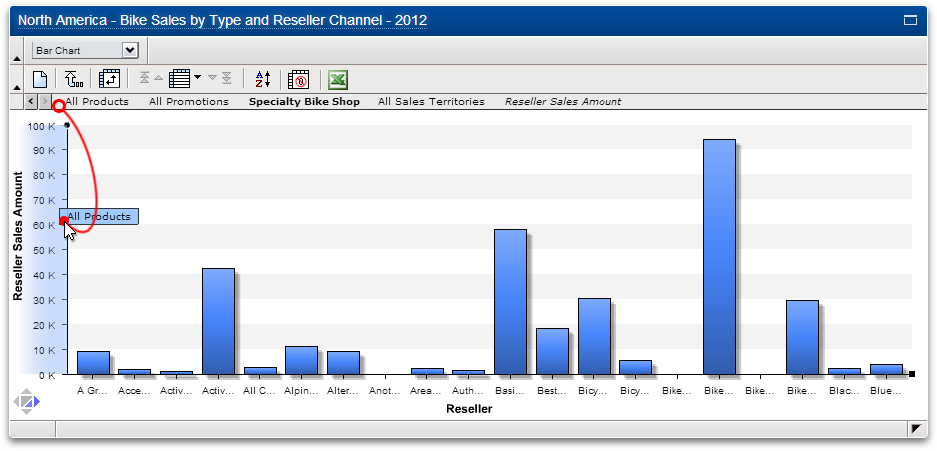
- Bar Chart.
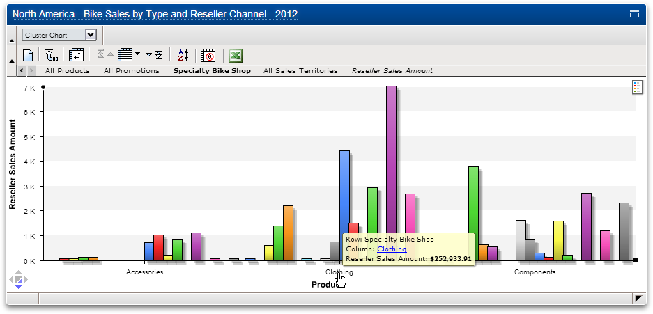
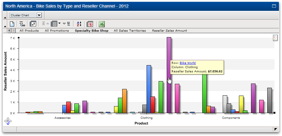
- Cluster Chart. Clicking on any label allows the user to drill down in the cube. The blue, underlined label in the tooltip clearly shows the user what dimension is being hovered over. This is very helpful when labels are shortened or not visible.
- Tooltip.
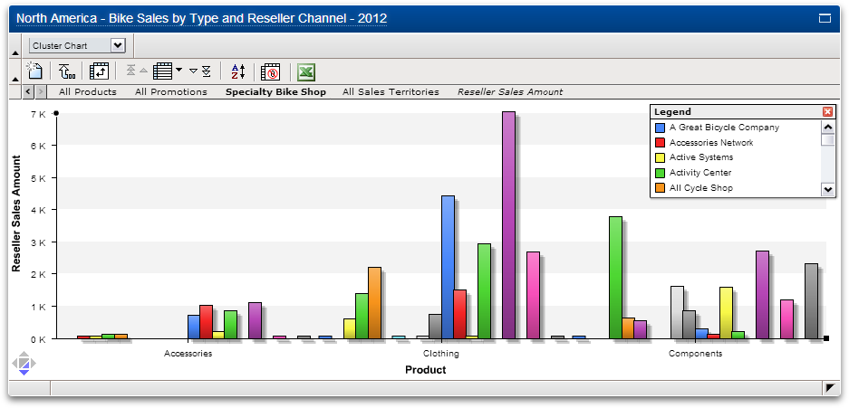
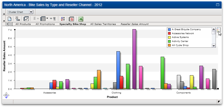
- Legend.
- Legend minimized.
- Minimized legend when the user hovers over it.
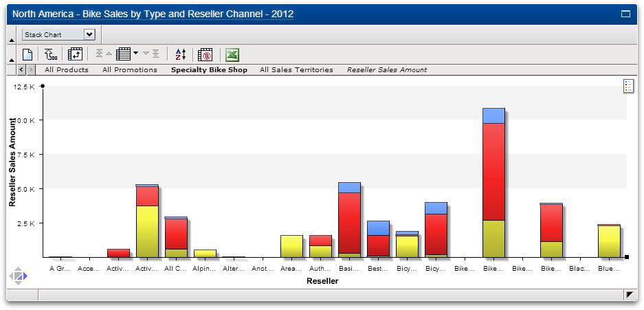
- Stacked Chart.
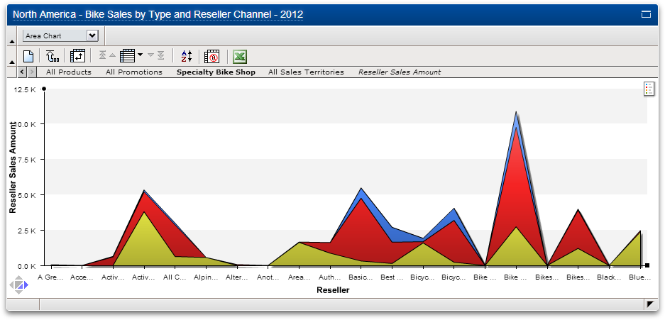
- Area Chart.
- Pie Chart.
Replacing rows and columns with charts
- Start.
- Drag a dimension atop any axis, then drop. Any dimension from any level can do this.
End of demo.
Paul Balchin